
A Review of Web Application Development Standards and Frameworks
In today’s digital world, a strong mobile web design strategy is crucial. With mobile internet use at an all-time high, a mobile-friendly website isn’t just an option—it’s a must. To craft an effective mobile web design, consider these ten essential factors to ensure your site meets user expectations and excels in a competitive landscape.
1. Understand Your Audience
Before diving into design specifics, gain a deep understanding of your target audience. Analyze their behavior, preferences, and how they interact with your site on mobile devices. Are they using smartphones or tablets? What are their browsing habits? This insight will help tailor your design to meet their needs and preferences.
2. Prioritize User Experience (UX)
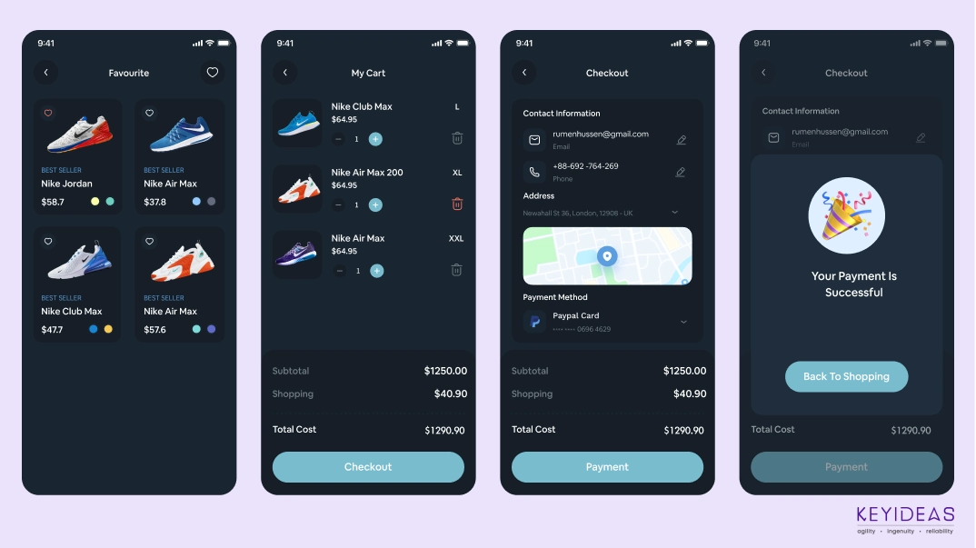
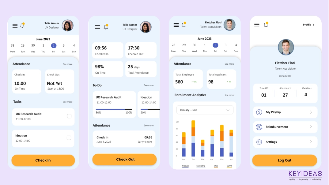
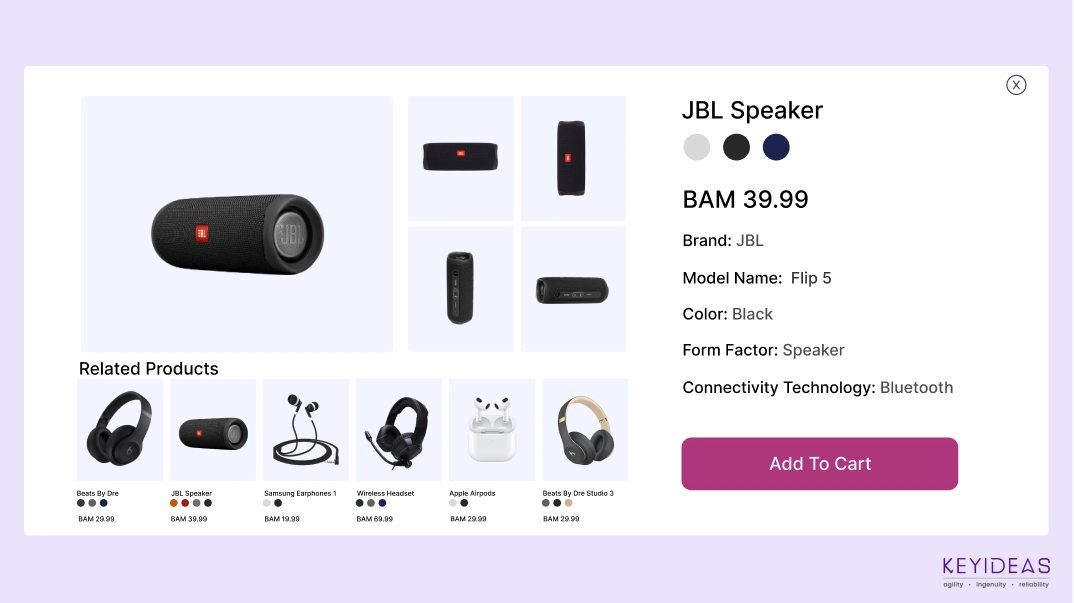
User experience should be at the forefront of your mobile web design strategy. Mobile users expect a seamless and intuitive experience. Ensure your design is user-friendly with easy navigation, clear call-to-action buttons, and a streamlined checkout process. A well-designed mobile UX can significantly enhance user satisfaction and engagement.
3. Adopt a Mobile-First Approach
Start your design process with mobile devices in mind. A mobile-first approach ensures that your website is optimized for smaller screens and then progressively enhanced for larger screens. This method helps prioritize essential features and content, ensuring that the core functionality is effective on mobile devices.
4. Responsive Design is Key
A responsive design automatically adjusts your website’s layout and content based on the user’s screen size. This flexibility is crucial for providing a consistent experience across various devices. Implement responsive design principles to ensure your site looks and functions well on all screen sizes, from smartphones to tablets.

5. Optimize Loading Speed
Speed is a critical factor for mobile users. A slow-loading site can lead to higher bounce rates and lower user satisfaction. Optimize images, use compressed files, and leverage browser caching to enhance loading times. Tools like Google PageSpeed Insights can help you assess and improve your site’s performance.
6. Ensure Readability
Text readability is paramount on mobile devices. Use larger font sizes and adequate line spacing to make reading easy without zooming. Choose fonts that are legible on smaller screens and maintain a high contrast between text and background to enhance readability.
7. Design for Touch Interaction
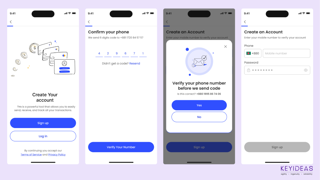
Mobile devices rely on touch interaction, so design elements should be optimized for finger taps. Buttons and links should be large enough to be easily tapped, with ample spacing to prevent accidental clicks. Implement touch-friendly gestures and avoid hover-dependent interactions.
8. Test Across Multiple Devices
Testing your website on various devices and operating systems is crucial to ensure consistent performance and appearance. Different devices may render your site differently, so thorough testing helps identify and resolve any issues. Use emulators and real devices for comprehensive testing.
9. Optimize Forms for Mobile
Forms are an integral part of many mobile experiences, from sign-ups to purchases. Ensure that forms are easy to complete on a mobile device by minimizing fields, using input masks, and providing clear labels. Implement auto-fill options and responsive design to simplify the form-filling process.
10. Monitor and Analyze Performance
Once your mobile website is live, continually monitor its performance using analytics tools. Track user behaviour, identify any issues, and assess how well your design meets your goals. Regular analysis allows you to make data-driven improvements and adapt to evolving user needs and technological advancements.
Conclusion

A successful mobile web design strategy goes beyond visual appeal; it demands a focus on user needs, performance, and adaptability. By understanding your audience, prioritizing user experience, and monitoring performance, you can create a compelling mobile web presence that meets user expectations and supports your business goals.

The effectiveness of an online platform solely depends on UX or user experience which is also expressed as the customer satisfaction.

Software Development Outsourcing has been an increasingly popular trend for several years now. Find out benefits of offshore and outsource.

Mobile e-Commerceis a natural progression of eCommerce as Mobile e-Commerce Increase Customer Loyalty and Retention of the customer.
Apple's iBeacon ios app enables retailers to extend tailored messages when the customer is in-store thus reducing marketing efforts and costs for them.
