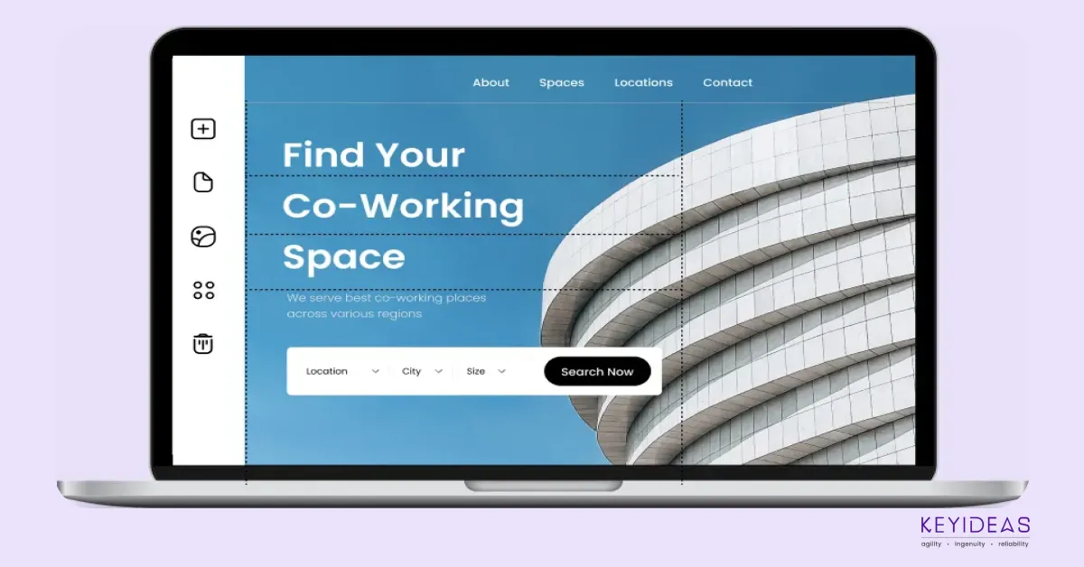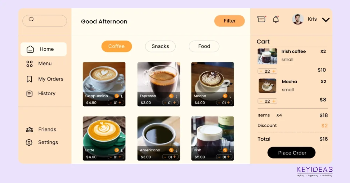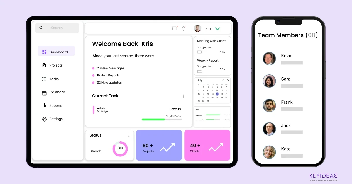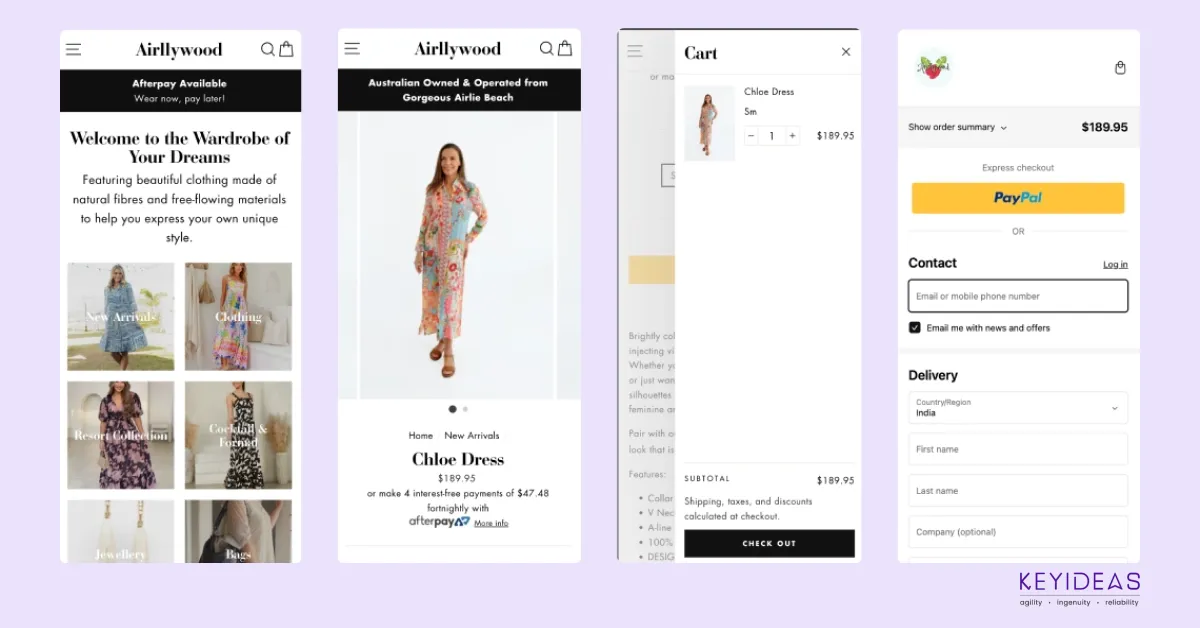
With nearly 55% of internet browsing done on tablets and smartphones, responsive web design is crucial. This approach ensures that websites look good and function well on all screen sizes, automatically adjusting for different devices. Whether viewed on a desktop or smartphone, a responsive website adapts seamlessly to any screen size or orientation.
Works With A Single Site
A responsive website eliminates the need for separate mobile and desktop versions. Instead, it uses a single design that ensures consistent display across all devices.
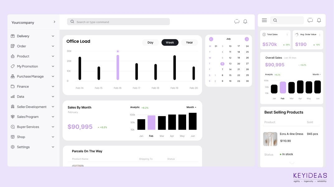
Flexible Content Adjustment In A Responsive Web Design
Responsive web design ensures content adapts smoothly across different layouts. Test how your site adjusts by analyzing browser width and breakpoints, ensuring text, images, and elements display well on various screen sizes, including narrow smartphone screens.
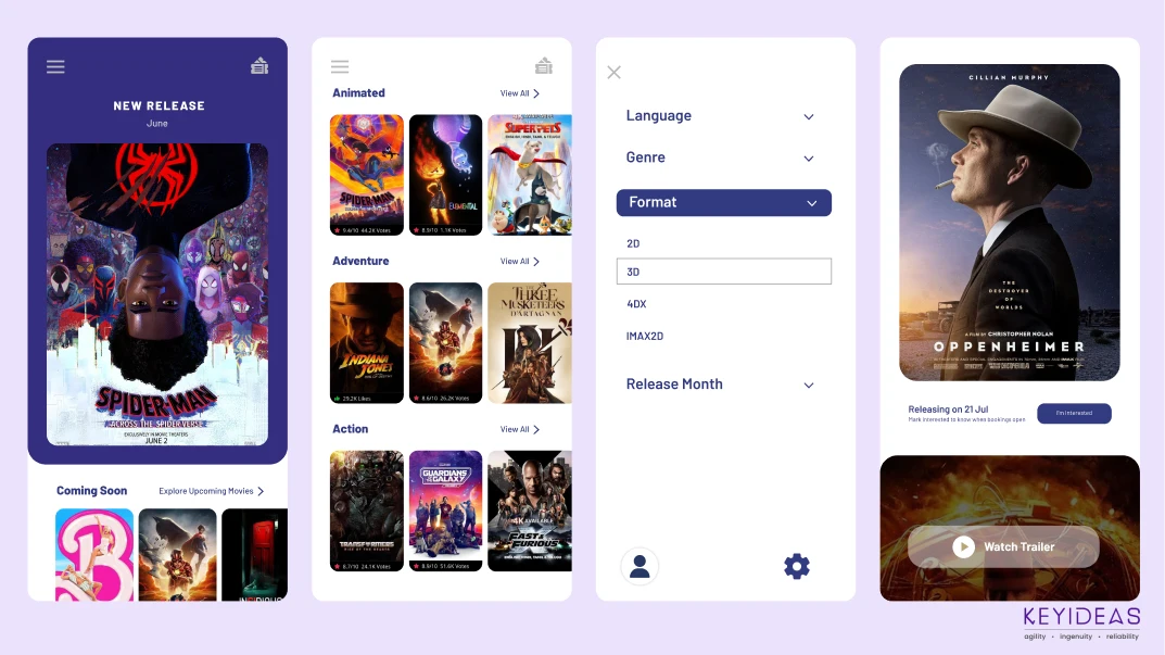
Producing A Breakpoint – Easy And Straight-forward
Setting breakpoints with meta tags ensures your website displays correctly on different screen sizes. Meta tags guide the browser in adjusting content, while CSS with a 100% width property helps images and elements scale properly across devices, allowing seamless adaptation to various layouts.
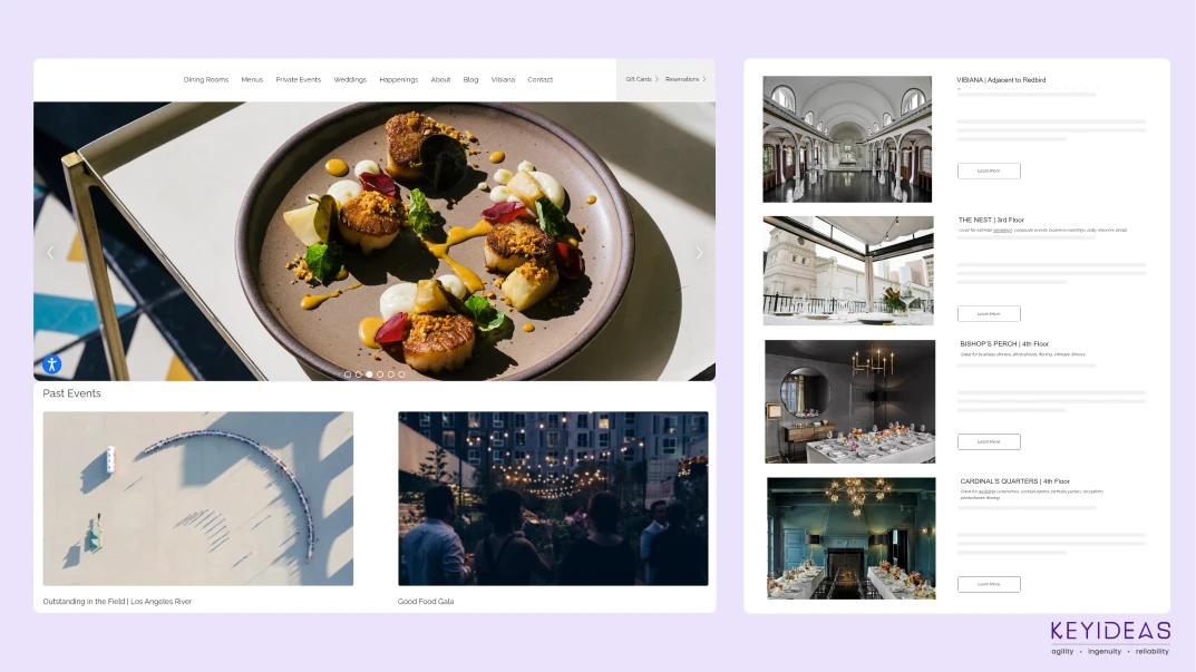
What Is Responsive Web Design Without Changing Resolutions?
Website resolution qualities are evolving, but you can set various resolutions for a responsive site to ensure it looks attractive on all screens. Using fluid grids helps create a more adaptable site, allowing you to adjust text and visual resolutions for optimal display on any device.
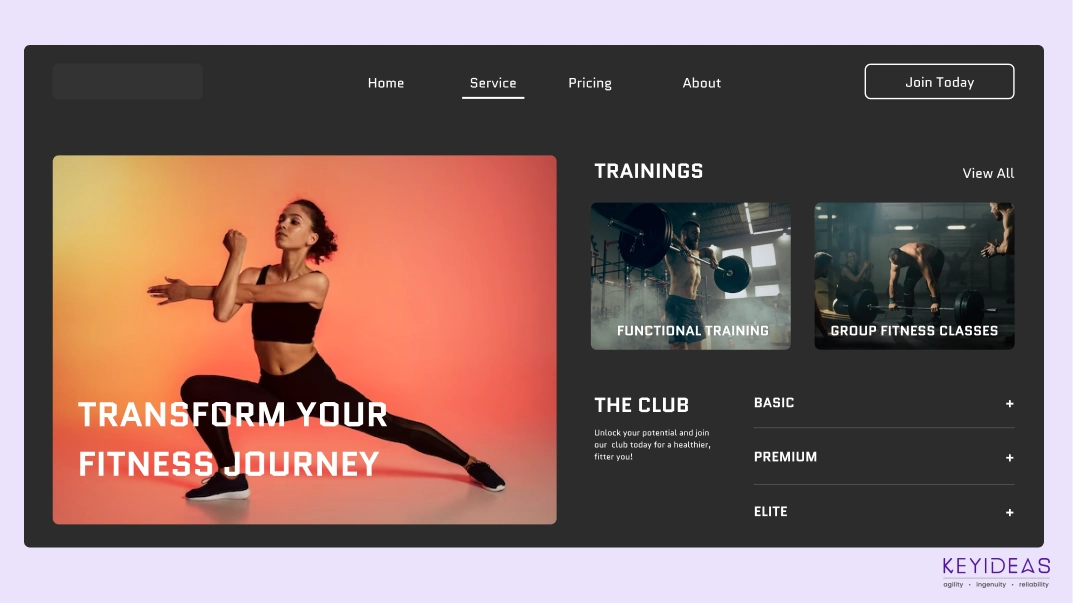
How About Scrolling Effects?
The final aspect of responsive web design is incorporating scrolling and click effects to enhance visual appeal. These effects can trigger new screens or animations, making the site more engaging. Proper planning ensures these effects display correctly and attractively on all browsers.
What Can You Learn From Responsive Web Design?
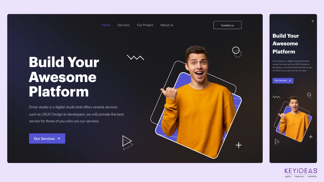
Your effort in producing a responsive website is critical to your success. You have to look at how your website can adapt to the desired mobile-friendly design. Make sure your current web design is prepared to get the best new approach to web design .
The best thing to do before getting your web design plans ready, observe the working of the site through various devices. Scrutinize whether your site is mobile-friendly. The key here is to make sure you notice that you’re getting your content displayed – easy and precisely on all devices.
PHP Laravel Service Provider creates full-stack & robust PHP web applications for you. Hire an expert offshore Laravel Development Company to get your app done.
Hire a top-rated Bagisto Development company from India. Bagisto development services are creating feature-rich Laravel-based E-store for your online business.
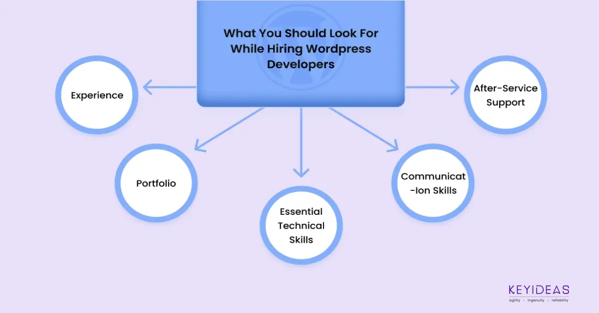
Looking to hire & work with top WordPress developers? Then this guide is for you. Know the major characteristics of the best WordPress site development company.
Hire best Blazor developers and leverage all the advanced capabilities in your web application. Learn more about the top Blazor development company
