
Optimizing mobile websites isn’t just about speed; it’s about creating a smooth and engaging user experience. Mobile users expect fast, responsive sites that are easy to navigate. With mobile-first indexing being a priority for Google, optimizing your mobile website for performance is crucial for improving SEO and user engagement.
Here are five key strategies that will help your website perform better on mobile devices.
Maximize Mobile Performance: 5 Key Optimization Techniques
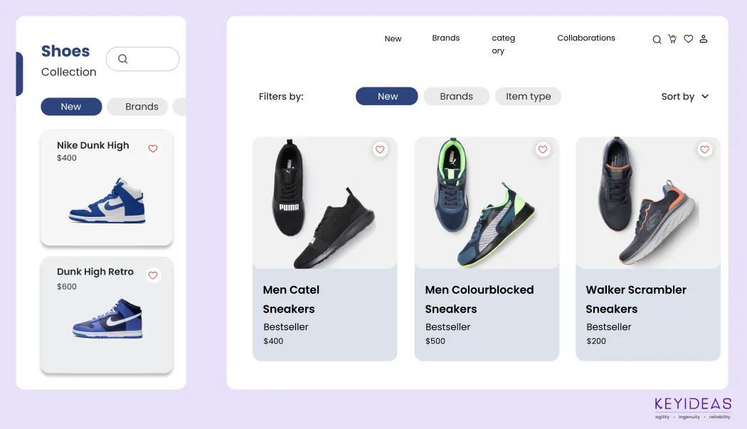
Implement Responsive Design
Responsive design ensures that your website adjusts its layout and content to fit any screen size, from smartphones to tablets to desktops. Without it, users might struggle to navigate or read content, especially on mobile devices.
Benefits:
- Consistent user experience across all devices.
- Improved SEO, as Google favors mobile-friendly websites.
- Higher user engagement and lower bounce rates.
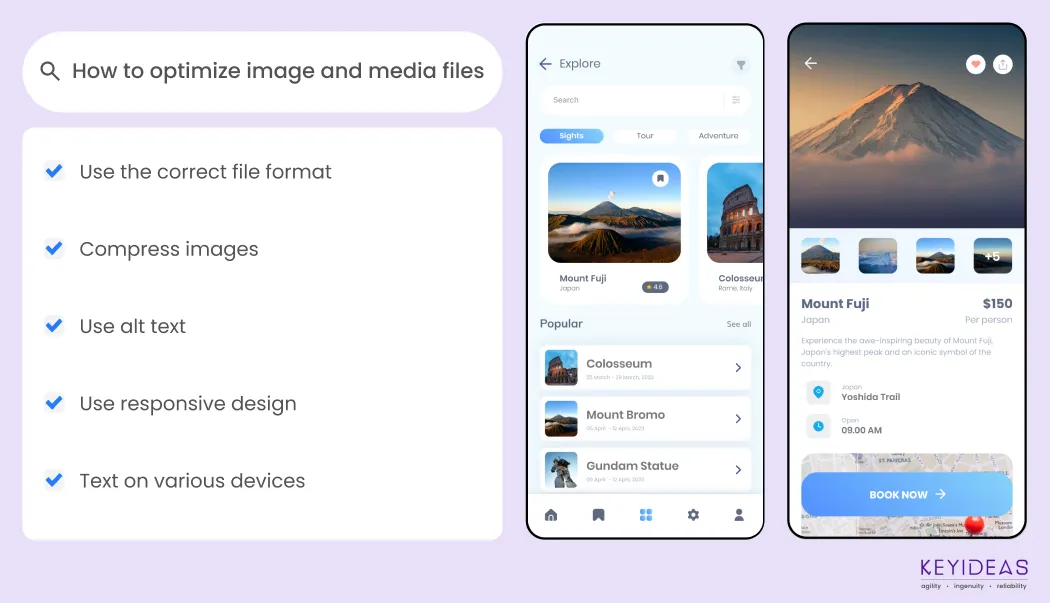
Optimize Image and Media Files
Large images and videos can significantly slow down your website’s load time, especially on mobile networks. Optimizing media files ensures your pages load quickly, even on slower connections.
Benefits:
- Faster loading times.
- Better performance on mobile networks
- Improved user satisfaction and retention
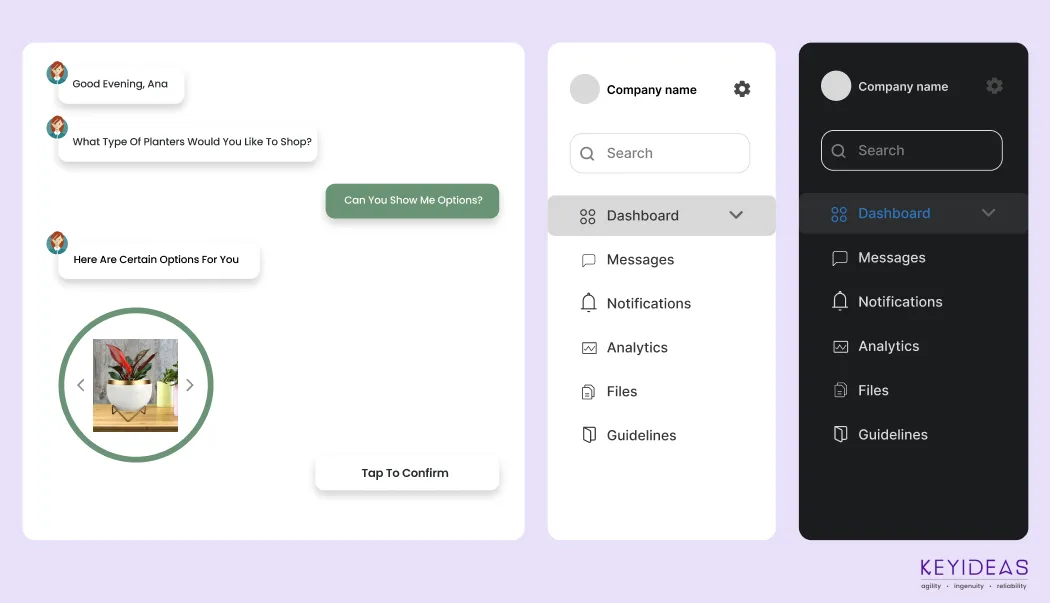
Organize Content with Multi-Page Structure
Separate core content on the main page and link to secondary pages to reduce HTML size and unnecessary dependencies. Avoid heavy images on the main page; use tabs for images and extra options. For mobile, minimize redirects to ensure a smoother experience.
Benefits:
- Less content on the main page means quicker load speeds.
- Structured, easy-to-navigate pages enhance the mobile experience.
- Limiting images and resources on the main page conserves bandwidth, especially on mobile

Improve Mobile Navigation and UX/UI Design
Navigation is one of the most important aspects of mobile usability. A user-friendly mobile menu can improve user engagement, reduce bounce rates, and ultimately increase conversions. A well-designed mobile interface (UI) is crucial for providing a seamless and enjoyable browsing experience on any device, which is a key factor in both SEO and user retention.
Benefits:
- Enhanced mobile UX that makes it easy for users to find information, leading to improved engagement and retention.
- Higher conversion rates through optimized mobile navigation and UI elements.
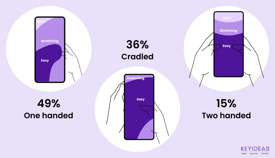
Finger-Friendly Design
Mobile devices are touchscreen-based, and users may struggle to interact with small or poorly placed elements.
Benefits:
- Larger buttons and links make it easier for users to navigate.
- Proper spacing and touch-friendly designs reduce mistakes, making interactions smoother.
- Easier navigation leads to more user interaction, increasing the likelihood of completing goals (e.g., making a purchase).
- Increased conversions and improved user experience.
Conclusion
Optimizing your mobile website is no longer optional — it’s essential for staying competitive in the digital landscape. By implementing responsive design, optimizing media, minimizing HTTP requests, enabling browser caching, and focusing on mobile-specific features, you can ensure your site loads faster, performs better, and provides a seamless experience for all users, no matter the device.

PHP Laravel Service Provider creates full-stack & robust PHP web applications for you. Hire an expert offshore Laravel Development Company to get your app done.

Hire a top-rated Bagisto Development company from India. Bagisto development services are creating feature-rich Laravel-based E-store for your online business.

Looking to hire & work with top WordPress developers? Then this guide is for you. Know the major characteristics of the best WordPress site development company.
Hire best Blazor developers and leverage all the advanced capabilities in your web application. Learn more about the top Blazor development company