Responsive WordPress Website for a Children’s Health Education Nonprofit
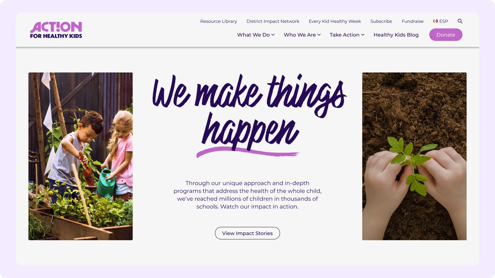
If you run a nonprofit that publishes guidance on children’s health, nutrition, fitness, and wellness, your website carries a heavy load. Teachers, school staff, parents, and volunteers all arrive with different questions and very different amounts of free time. A cafeteria manager hunting for a quick idea has little patience for a page that buries it, while a parent reading on a phone between errands needs something that opens cleanly and reads easily. Content that is valuable but hard to reach quietly fails the people it was written for.
Volume makes this harder. Nonprofits in education accumulate articles, guides, toolkits, and event pages over many years, and without a clear structure the archive becomes a maze. Menus grow crowded, titles overlap, and visitors cannot tell where one topic ends and another begins. Staff who add new material often have no consistent template to follow, so pages drift apart in layout and tone. The longer this continues, the more effort it takes for anyone, inside or outside the organization, to trust that they are seeing the best material.
Devices complicate the picture further. Educators frequently work from school computers with older browsers, parents lean on phones, and administrators may open a tablet during a meeting. A layout designed for one screen can become cramped, clipped, or painfully slow on another. Because the audience is broad and not especially technical, any friction is read as the organization being hard to reach. Resources that cannot be opened comfortably on the device at hand might as well not exist, no matter how carefully they were prepared.
Then there is the work of inviting people in. A nonprofit lives on supporters who join mailing lists, volunteer, and give money, yet those requests can feel awkward or hidden on a site crowded with information. If sign-up forms and donation paths are tucked away, interested visitors drift off without ever being asked. If they are pushed too aggressively, they distract from the reading that brought people there in the first place. The balance between serving readers and welcoming supporters is delicate and easy to tip.
Keyideas created a responsive WordPress website for Action for Healthy Kids, using Bootstrap to give every page a flexible grid that adapts from wide desktop monitors down to small phone screens. Menus, headings, and content blocks reflow predictably, so a reader sees the same clear order of information regardless of device. Choosing WordPress gave the organization a familiar editing environment, which means staff can maintain pages themselves, publish updates without developer help, and keep the look consistent from one section of the site to the next.
The information architecture received particular attention. Keyideas grouped material under the main subjects of children’s health, nutrition, fitness, and wellness, then shaped navigation so a teacher or parent can reach a relevant resource in a few clicks. Page templates follow repeatable patterns for articles, guides, and landing areas, which keeps long-form content scannable with strong headings and generous spacing. Related items link to one another, helping visitors continue exploring a topic instead of hitting a dead end after reading a single page, which keeps people learning longer.
Engagement features were designed to sit comfortably beside the educational content. Keyideas added sign-up functionality that lets visitors join the community and receive updates, along with fundraising functionality that gives supporters a straightforward route to contribute. Calls to action appear where they make sense in the reading flow, with forms kept short and clear. This allows the organization to invite participation without crowding the resources themselves, so a visitor who came to learn can also quietly decide, at their own pace, to get involved when ready.
Keyideas also tuned the front end so the site opens comfortably on the older school computers, tablets, and phones that this audience actually uses. Bootstrap components handle spacing, buttons, and form fields consistently, which reduces the odd visual glitches that appear when custom code is stacked on custom code. Images and text are arranged to load in sensible order, and the structure stays simple enough for new contributors to learn quickly, protecting the quality of the site as the library of resources keeps growing year after year.
Have a question or need support? Our team is here to help and will get back to you within one business day.
* indicates required fields